Mabinogi World Wiki is brought to you by Coty C., 808idiotz, our other patrons, and contributors like you!!
Keep this wiki going by contributing to our Patreon!
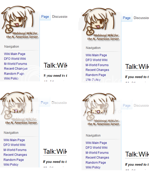
The "Now Open!" Sign
What's different about it? I never paid that much attention to it since we had it for years...which is why it should be changed, by the way. The phrase is kind of dated for a site that's been open for about 4 years, disregarding the periods of downtime we've had.
Ah. Okay. My browser still using the cached version of that image, so it's still showing up as the transparent one.
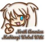
If other people agree, we can always change it. Several staff thought it looked better though, so you're in the minority right now. Also, the colors were taken from an actual Nao picture.
I personally think the coloring looks good. As stated before, it's the fact that it's still saying "Now Open" after all these years that bothers me about it. lol
An explanation of what could fix it would be nice. And "going back to the old one" isn't an answer we're that interested in right now.
Well, Nao's hair is pretty white. Maybe we should just make the wiki black, then it'll be noticeable :P
Why don't we hold a contest on the forums to design a new logo? Then hold another event to vote on the approved ones. Good publicity and should solve our problems.

That. Neck + Clothing. Is. Full. Of. Lols. Doesn't seem to match the image very well.
What's wrong with the old transparent version? Any kind of coloring on it looks tacky IMO.
well the original point is that if the logo to be used is colored, the hair should be filled in, not hallow.
I'd prefer Pyro's idea of holding a contest for a new logo. If we're altering the logo from the original anyway, we might as well make a completely new one and hold a contest.
There's no sense in uploading a colored Nao with the "Now Open!" sign. At least the transparent one was there forever so it looks like it hadn't been touched since the beginning of the wiki, which was kind of cool and at least made the outdated sign excusable to an extent.
Just coloring Nao and keeping the "Now Open!" sign at this point seems pretty unnecessary, unless the transparent version was lost and/or "Now Open!" is the wiki's official slogan or something.
Can someone link the file of the original clean version complete with transparency and all @@? I'm too lazy to look for it and I might have an idea... nvm I found something in the old archives...
Prefereably one with out the "Now Open!" thing...though Maxwell might be on to something...
I used Jspiller's version: File:WikiProposal.png. The text could be easily removed.
Also, I was thinking softer colors would be more appealing? http://i315.photobucket.com/albums/ll452/Aramet/NaoLogoExample2.png
lol no one has bothered to change the shadowing on the hair...which was meant for an outline only and makes it look hallow which was the whole point...
even if a 3d effect is trying to be achieved, the shadows still need to be corrected, as they conflict with the shadowing in the mouth, which come from a top-down lighting.
Here's one using the palate of Nao's Portrait: http://i1182.photobucket.com/albums/x454/LexisMikaya/WikiProposalNaoPalate.png
Disregard the text...I'm figuring all that out...x.x
I did something similar, but with a blue eye o-o http://i1182.photobucket.com/albums/x454/LexisMikaya/WikiProposalcopy.png
Neither of those look good imo. . . I'd rather have the original uncolored icon.
Yeah, I'd rather just have the original icon, minus "Now Open!"
or just the actual image from the game, including the "Please read carefully"

This one right @@? let's just get the Mabinogi font used for the logo and some how put "Wiki" in there...and use the image above? Though the current one is just a rehash of the one I linked here.
The current Logo? I like it, but I think we need a change, especially around the "now Open!" text. Plus badly colored, but that's just me being a critic :x
If you can get on IRC and convince Kadalyn to hold a contest or pick a better logo, I will change it. I will not revert to the old image unless there is an agreement among the MW admin.
In regards to this entire thread, there are exactly 4 people that dislike this change to any extent. So I'm sorry to say, but you are only a noisy few.
The Now Open sign was left because of the significant change to MabiWorld, mostly in regards to reopening after the downtime. We do plan to remove it after discussing suitable replacement text.
The official image from the game files cannot be used as our logo, it's copyrighted.
As for Saria's replacement suggestion; it does look good. However, we serve a lot more than North America; including Oceania and Europe. If we could find something that is all inclusive of the service range, I would prefer it. Though, NA is fine in the end, considering it is Nexon NA that manages it.
You know, I forgot about that...I forgot to make versions without "North America" on it @@ but considering we can't use it as our logo to promote since it's copyrighted and all...I could make another one or try to if I have time :x and I think enough time has passed for "Now Open!" or at least to me anyways...and we need more color in our world D: monochrome/monotone is great but the game has such a colorful world...I doubt it'll look great without colors...
The one we use is redrawn, so it's okay to use. If you do think of text without NA in it, please post it!
Here's both versions just saying the wiki without NA in it:
Full Color
No Eye Color
take your pick.
If you have any suggestions on how to place the text...fire away.
Hrmmm, I'm not sure which. Every time I switch to the eye, it surprises me, but I adjust to it quickly and start to like it. xD
dat splash of blue...but yeah the reason for the no eye color one is because I was used to the logo without the eye x.x;; now it's so colorful *o* feel free to throw a poll somewhere on the forums or something...I'm busy studying for finals in about a week...they got bumped ._. . . .